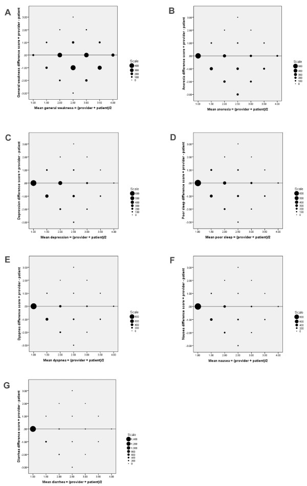
Figure 2.
Bland-Altman plots, one for each symptom (see also Figure 1). The difference between patient and provider score (difference score = health care provider score minus patient score) plotted against mean symptom score. The size of markers reflect the number of individual observations and only the line of equality (difference = 0) is shown. Negative differences mean that providers underestimated the symptom. The larger the size of the markers at one side of the line of equality, the larger was the tendency of a systematic difference between assessments (i.e. more observations below the line suggest that providers had a negative bias and underestimated symptom intensity). Whether differences between provider and patient assessments changes with the mean value of symptom intensity is determined by looking for patterns along the x-axis. (A): Generalized weakness. (B): Anorexia. (C): Depression. (D): Poor sleep. (E): Dyspnea. (F): Nausea. (G): Diarrhea.

