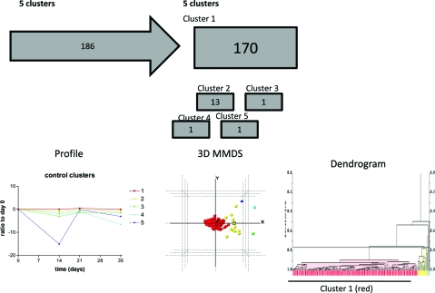
Figure 6.
Cluster analysis of data set showing the workflow and clusters generated. Control sites across the course of the experimental gingivitis study were clustered using PolySNAP3. Group 1 showed no changes from baseline, whereas groups 2−5 differed from baseline over the course of the experiment (Control clusters). Below the flow diagram are graphs representing the mean (±sem) changes of the proteins in each cluster, which are followed beneath by 3-dimensional metric multidimensional scaling (MMDS) plots and dendrograms showing the relationships of individual proteins with others in the analysis group. Colors of lines on graphs, spheres on 3D plots and bars on dengrograms coordinate to show the same clustering.

