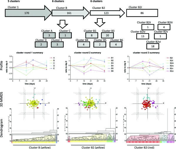
Figure 7.
Cluster analysis of data set showing the workflow and clusters generated. Proteins identified from group 1 were used for the next step of the analysis using normalized test data which were clustered using PolySNAP3. Five clusters (clusters A-E) were generated (cluster round 1 summary), with 161 proteins identified in cluster B. The proteins in cluster B were then further analyzed by PolySNAP3 to generate 6 clusters (clusters B1−6; cluster round 2 summary). The largest group from this analysis was group B2 (123 proteins). This group was then further analyzed using PolySNAP3 to generate 6 clusters (clusters B2i-vi, cluster round 3 summary). Below the flow diagram are graphs representing the mean (±sem) changes of the proteins in each cluster, which are followed beneath by 3-dimensional metric multidimensional scaling (MMDS) plots and dendrograms showing the relationships of individual proteins with others in the analysis group. Colors of lines on graphs, spheres on 3D plots and bars on dendrograms coordinate to show the same clustering. It should be noted that the highlighted, largest group on each dendrogram was the group taken forward into the subsequent round of clustering analysis.

