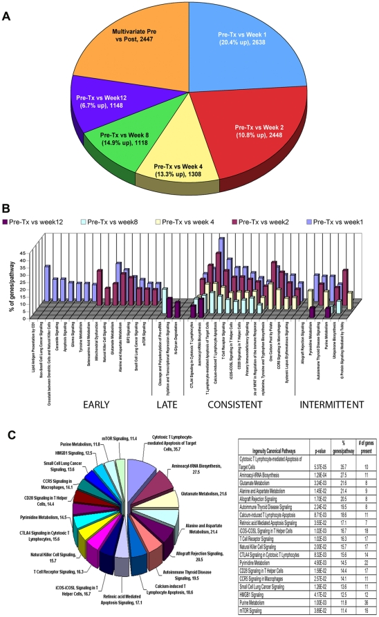
Figure 3. Gene expression profiling and functional analysis of whole peripheral blood.
(A). A Pie chart summary for the number of differentially expressed genes in whole blood obtained in each time class-comparison analysis (p<0.001). The size of each slice represents the percentage of genes in that class based on the total of differentially expressed genes identified in all of the analyses done. Significant differential gene expression for each Post-TX timepoint was determined against the Pre-TX samples and these are represented in this figure as “Pre-TX vs. Week 1” and so on. In parallel, we performed ANOVA comparisons for all timepoints to determine what we have termed the “multivariate” genes that change significantly and differentially in a coordinate fashion at all timepoints post transplantation. (B). Functional analyses of the significant differentially expressed genes populating statistically significant Ingenuity pathways. The results for 5 timepoint comparisons: Pre-TX vs. week 1, 2, 4, 8 and 12 are shown in different colors. The Y-axis depicts the % of genes identified in our results vs. the total number of genes known to populate the pathway in the literature upon which Ingenuity mapping is based. We identified 4 different classes of differentially expressed genes mapping to these functional pathways: early, late, consistent and intermittent. The majority of genes are in the early and consistent classes. (C). Pie chart representing the 19 significant functional pathways populated by 134 significantly differentially expressed multivariate genes, with percentage of multivariate genes per total genes in a pathway. On the right, the 19 functional pathways shown in the pie chart are ranked by their p-value significance and includes the % genes populated per pathway, and the total number of genes identified for each pathway in our samples.

