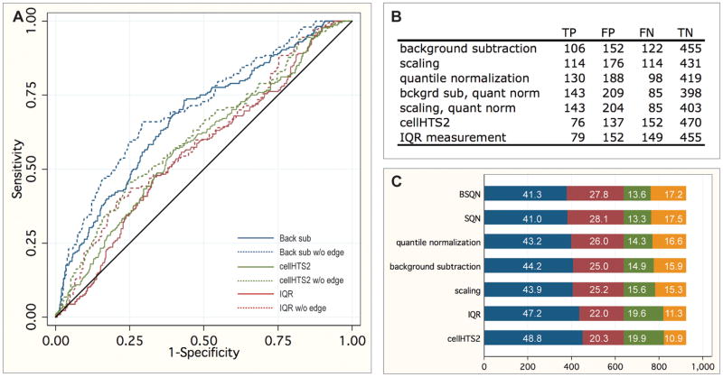
Figure 2.
Analysis of normalization methods. A. ROC curves for the best (background subtraction, blue) and worst (cellHTS2, green, and IQR measurement, red) normalization methods, both with (solid lines) and without (dashed lines) dsRNA located in the outer edge of the screening plate. The reference line is indicated in black. B. Area under curves for each method tested, both with and without dsRNA located in the outer edge of the screening plate. C. Number of true negatives (TN, blue), false positives (FP, red), false negatives (green), and true positives (orange) for each normalization method at thresholds of the top 5% ranked wells. Percentages of element are given.

