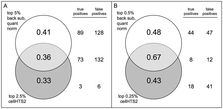
Figure 3.
Comparisons between normalization methods. Venn diagrams representing the ratio of true positives to total positives for A. the top 5% ranked wells after background subtraction followed by quantile normalization and the top 2.5% ranked wells after cellHTS2 and B. the top 0.5% after background subtraction followed by quantile normalization and the top 0.5% after cellHTS2. Total numbers of true and false positives overlapping for each method are given to the right.

