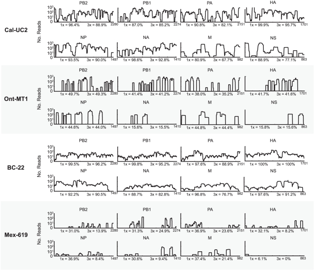
Figure 6. Coverage map of the influenza genome for four 2009 H1N1 samples.
For each originating location, the sample that was found to have the best coverage is shown. The coverage is plotted on a log scale as a function of nucleotide position. For each segment, the coverage percentages at 1X and 3X are indicated.

