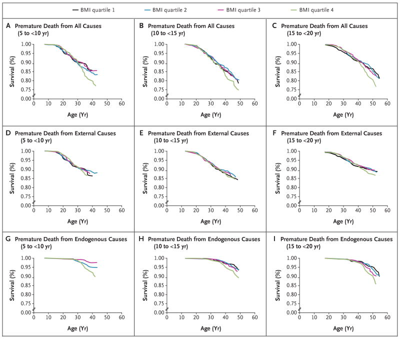
Figure 1. Kaplan–Meier Curves for Premature Death.
The graphs show the rates of premature death from all causes, external causes, and endogenous causes according to quartiles of age-standardized and sex-standardized body-mass index at different baseline ages during childhood and adolescence. Plots were computed with the use of baseline data. Age at baseline for each age group was taken as the midpoint of the age range.

