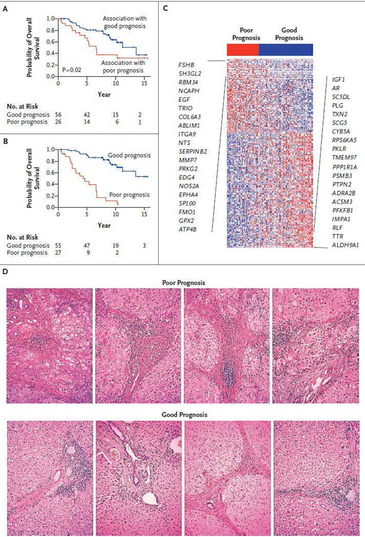
Figure 2. Survival Signatures and Survival Curves in the Training Set.

Curves are shown for survival according to the association of the gene signature with survival, based on leave-one-out cross-validation testing (Panel A), and for overall survival according to the level of expression of the 186 signature genes (Panel B); of these, 113 were associated with a good prognosis and 73 with a poor prognosis. Panel C shows the expression pattern of the survival signature (comprising 186 genes). The 20 genes most closely associated with a poor prognosis are listed on the left, and the 20 most closely associated with a good prognosis on the right. Red indicates high expression; blue indicates low expression. Panel D shows representative photomicrographs of sections of liver tissue adjacent to tumor that were profiled in this study; there were no histologic correlates with survival. Staining was with hematoxylin and eosin.
