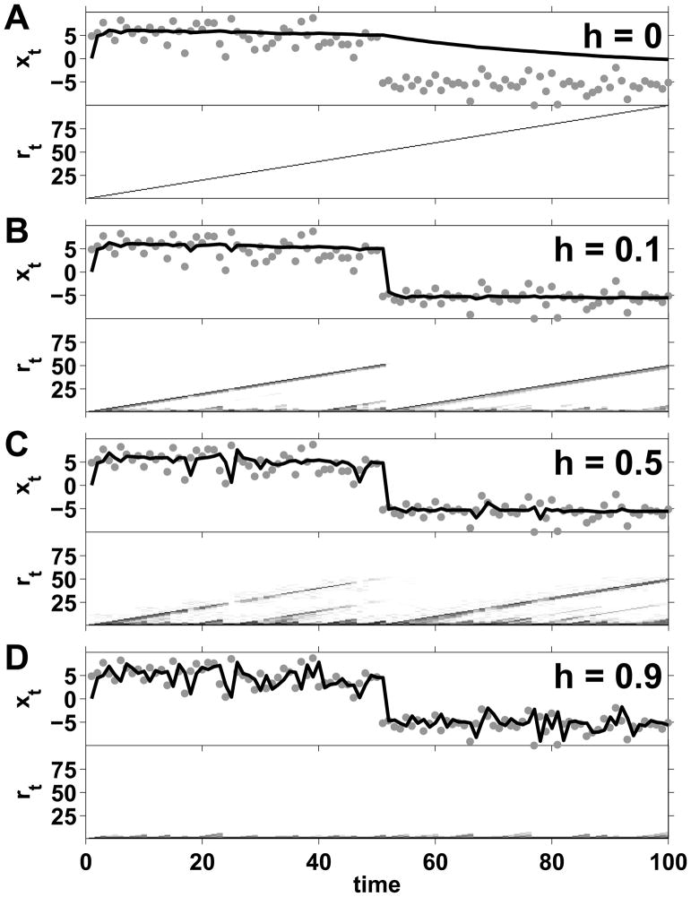
Figure 2.
Effect of changing the hazard rate on the mean of the predictive distribution generated by the algorithm in (Adams and MacKay, 2007) for a single data set. Each panel shows a different setting of the hazard rate h, as indicated. The top half of each panel shows the data (gray dots) along with the model’s predicted mean in black. The bottom half of each panel shows the logarithm of the run-length distribution, log p(rt|x1:t), with darker shades corresponding to higher probabilities. Clearly the predictions are heavily influenced by the choice of h and, without knowing the actual change-point locations, it is not obvious to tell which one is better matched to the data.

