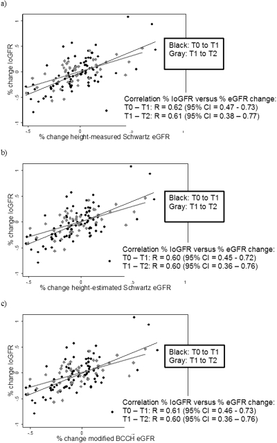
Figure 3.
Percentage of IoGFR change versus percentage of change in eGFR for each formula between each time period. Each graph contains the scatter plot and best fit line of the percentage of change in IoGFR versus percentage of change in eGFR (a) for the height-measured Schwartz, (b) for the height-estimated Schwartz, and (c) for the modified BCCH between two time periods. Time period T0 to T1 is plotted in black and time period T1 to T2 is plotted in gray. Pearson correlation coefficient “R” is displayed, with associated 95% confidence intervals.

