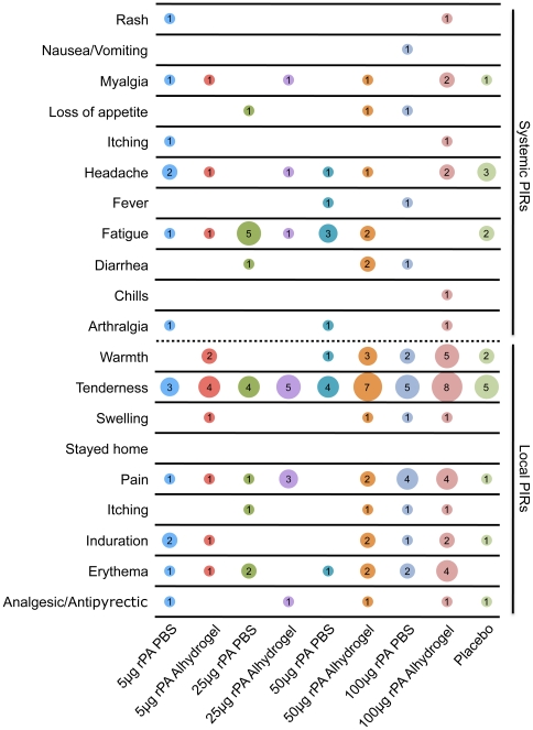
Figure 2. Post-injection reactions (PIRs).
The X axis displays the dosage groups along with all of the placebos, who were combined into one group. The Y axis displays the PIRs that were assessed in the study. The data displayed in the matrix represents the number of individuals who reported a given PIR and the size of the circle is proportional to the reported number. The top half of the graph consists of systemic PIRs while the bottom half of the graph consists of local PIRs.

