
Figure 4. Families of kindred cities.

The cross-correlation between SAMI time-series gives a measure of similarity, which can be used to group cities into clusters with similar characteristics; A) sorted correlation matrix (heatmap) for personal income in US MSAs with population over 1 million. Red (blue) denotes greatest (dis)similarity; B)Dendrogram showing detailed urban taxonomy of USMAs according to personal income. This clearly manifests clustering among cities with similar time trajectories. Here we used a decorrelation measure 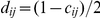 as distance between any two cities, where
  is the cross-correlation of Figure 4A. When the decorrelation
  ,
,  , indicating no correlation(dashed line), revealing five families of kindred cities. See Figures S2, S3, S4, S5, S6, and S7 for other quantities.