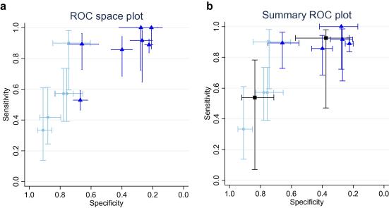
Fig. 2.
(a) Results of the individual ‘Rackoff’ CDR studies. The ROC space plots show each study estimates of sensitivity and specificity as a marker at the point estimate, with 95% confidence intervals demonstrated by lines. In reading such graphs, tests with a better discriminatory ability fall in the top left corner of the plot, and non-discriminatory tests fall on a 45° line between the bottom left and top right. The dashed lines (light blue)/circles represent the dichotomy of low and medium versus high risk groups (5 datasets), the solid lines (darker blue)/triangles between low versus medium and high (7 datasets). The outlier (32) is towards the centre of the graph. (b) Pooled results of the ‘Rackoff’ CDR meta-analysis. The dashed lines (light blue)/circles represent the dichotomy of low and medium versus high risk groups (4 datasets), the solid lines (darker blue)/triangles between low versus medium and high (5 datasets). The meta-analytic summary estimates are shown in heavy lines (black)/squares. (For interpretation of the references to colour in this figure legend, the reader is referred to the web version of this article.)

