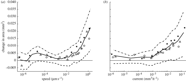
Figure 6.
Correlation between the change in cross-sectional area and the predicted flow. The graphs were produced by using the time-lapse model to calculate the current in each cord. The flux density or speed of flow was calculated by assuming that the interior of the vessels carrying the mass flows occupies half the total cross-sectional area. These graphs were produced by partitioning the data from all experiments and all time steps into ten bins of equal size according to the calculated speed or current. Each point on the curve indicates the (a) mean speed or (b) mean current, plotted against the mean change in cross-sectional area for one of these bins. Thick solid lines indicate the mean over all experiments, and thick dashed lines indicate the first and third quartiles over all experiments. Other markers indicate the mean values for individual experiments.

