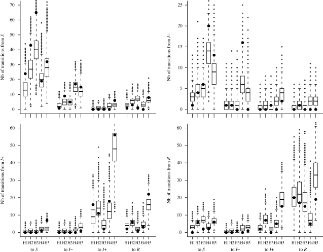
Figure 3.
Goodness-of-fit assessment. Boxplots summarize the posterior predictive distributions of simulated numbers of weekly transitions between observed health states (S, I − , I+ and R) in each herd (H1–H5) during the one-month follow-up. The quartiles are represented by horizontal lines. The whiskers indicate maximum and minimum values of the simulated distributions that lie less than 1.5 interquartile range lower or higher than the first or the third quartiles, respectively. Simulated values beyond the ends of the whiskers are indicated by a point. Black circles represent numbers of transitions between observed health states in our dataset.

