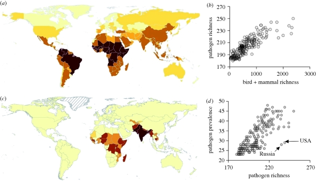
Figure 1.
Map showing geographical variation in human pathogen richness (a: darker red indicates greater richness; maximum 249) and the regions in which additional spending on disease control might have the greatest effect on human pathogen prevalence (c: on a logged scale, darker red indicates more additional spending recommended; maximum $8.5 billion). (b) Scatter plot of the relationship between human pathogen richness and the richness of birds + mammals and (d) between human pathogen prevalence and richness.

