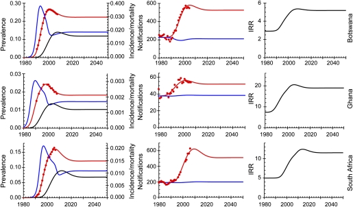
Fig. 1.
(Left) HIV prevalence (red line), annual incidence (blue), annual mortality (black), and prevalence in adults aged 15–49 y (red dots) (6). (Center) TB notification rates per 100,000 population per year (red dots) (1), fitted estimate (red line), and notifications in HIV-negative people (blue line). (Right)  , TB incidence rate ratio in HIV-positive compared with HIV-negative people. Note the different vertical scales.

