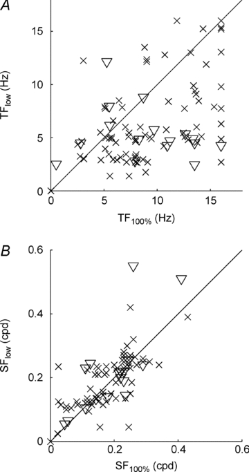
Figure 3. Scatter plots of the population data.

A, the optimum temporal frequency at low contrast (TFlow) plotted against the optimum temporal frequency at high contrast (TF100%). B, the optimum spatial frequency at low contrast (SFlow) plotted against the optimum spatial frequency at high contrast (SF100%). In each case, triangles denote simple cells (n = 16) and crosses denote complex cells (n = 77), as defined at high contrast.
