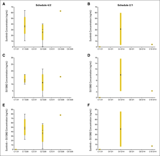
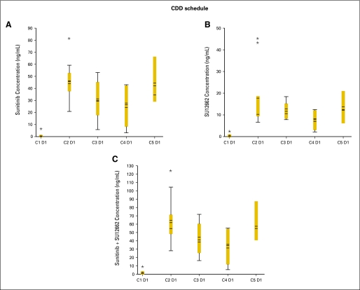
Fig A3.
Dose-corrected trough plasma concentration versus cycle box plots at the maximum-tolerated doses. Schedule 4/2, 4 weeks on treatment, 2 weeks off treatment, panels (A), (C), and (E), Fig A3A; schedule 2/1, 2 weeks on treatment, 1 week off treatment, panels (B), (D), and (F), Fig A3A. Continuous daily dosing (CDD) schedule, panels (A), (B), and (C), Fig A3B. Boxes indicate mean data; horizontal bands within boxes indicate median data; vertical lines (“whiskers”) represent the range between the smallest and largest observations within 1.5 interquartile ranges. C, cycle; D, day. (*) indicates outliers.


