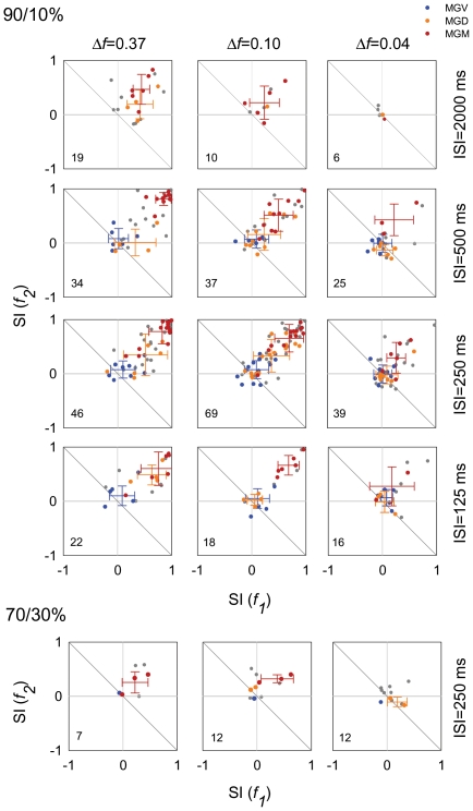
Figure 5. Analysis of SSA across MGB subdivisions in the population of neurons.
(A, B) Scatterplots of SI(f1) versus (f2), for the different Δfs (0.37, 0.10 and 0.04, from first to third columns), SOAs (2000 ms, 500 ms, 250 ms, and 125 ms, from first to fourth rows) and probabilities tested (In A, 90/10%; In B, 70 30%). Each dot in each panel represents data from one neuron. Neurons that were tested for more than one set of conditions are represented in more than one panel. Numbers in the lower left quadrant of the plots represent the number of neurons tested for each condition. Blue dots represent neurons from the MGV; yellow from the MGD and red from the MGM. Grey dots represent neurons that could not be assigned with certainty to one subdivision. Crosses indicate the mean and standard deviation for the localized neurons (blue for MGV; orange for MGD; and red for MGM). For the majority of conditions SI (fi) values lie above the reverse diagonal indicating the presence of SSA. SSA was strongest for the intermediate SOAs (205 and 500 ms), the largest Δfs (0.37 and 0.10) and the 90/10% conditions. SSA was strongest in the MGM, intermediate in the MGD and weaker in the MGV subdivision.

