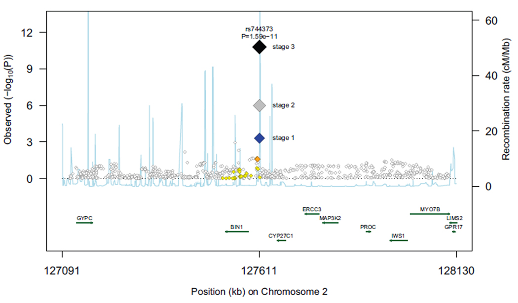
Figure 2.
Regional association plot for novel loci that were significantly associated (p<5×10⁻⁸) with AD in stage 3 analyses (rs744373 near BIN1, rs597668 near BLOC1S3 and MARK4). Each data marker represents the statistical significance (p-value) of each SNP plotted on the −log10 scale against its chromosomal position (NCBI build 36).The blue diamonds show stage 1 p-values for the sentinel (top) SNP at each locus, whereas the grey and black diamonds show the p-values for this same SNP following stage 2 and stage 3 meta-analyses, respectively. P-values from stage 1 for additional SNPs at that locus are color- and size-coded according to the strength of their linkage disequilibrium with the top SNP as follows: r2<0.2 white; 0.2<r2<0.5 yellow; 0.5<r2<0.8 orange; r2>0.8 red. The fine scale recombination rate is shown by the blue line which shows the average frequency with which recombination occurs (exchange of genetic material between maternal and paternal chromosomes during meiosis) at that site. Genes located in the region shown (on either strand of the chromosome) are shown as green lines with Human Genome Organization (HUGO) gene nomenclature committee gene symbols, the length of the green line represents the size/extent of the gene and the arrow the direction in which transcription of mRNA occurs.

