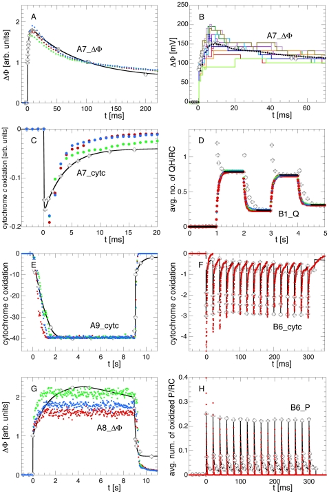
Figure 5. Experiments vs. Simulations with the Best Parameter Sets.
Comparison between the experimental data [5], [6] (open crosses) and the simulations with the three best scored parameter sets (red, green, and blue points). Also shown are the fit functions used for scoring the respective observable (black lines, for details see supporting Text S1). For clarity, only a single simulation run is shown for B6_cytc and B6_P (panels F and H). Here, the other two traces are indistinguishable from the ones shown. The variation between these three traces reflects the variability of the results with the optimized parameters when the same scenario is simulated repeatedly. Panel B shows the statistical variations between individual runs with the optimized parameter set. It shows ten individual traces and the average of 40 simulations as used during the optimization.

