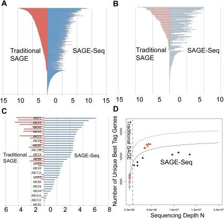
Figure 4.
SAGE-Seq tag mapping and sequencing depths saturation curve. (A–C) Differential coverage of expression profiles in three selected gene families: transcription factors (A), GPCRs (B), and ABC transporters (C). Y-axis lists the genes and x-axis is the mean gene expression index (logarithm of the normalized tag count). Red and blue colors mark traditional SAGE and SAGE-Seq, respectively. SAGE-Seq detects many more genes in these gene families than traditional SAGE does. (D) Number of unique best-tag genes (y-axis) in relation to sequencing depth (x-axis). The number of best-tag genes is the number of unique genes mapped by best tags, counted as one if multiple tags are mapped to the best tag of the same gene. Black and red colors indicate normal and cancer groups, respectively. Symbols “○” and “▴” mark traditional SAGE and SAGE-Seq, respectively. Solid curves (saturation curves) are from simulation by sampling the combination of all libraries in the normal (or cancer) group, which depict the trend with increasing sequencing depth. Traditional SAGE identifies much fewer best-tag genes than the SAGE-Seq. SAGE-Seq shows that cancer samples (red triangles) have a larger number of unique best-tag genes than normal samples (black triangles). This difference is not detected by traditional SAGE (red circles vs. black circles).

