
Figure 1.
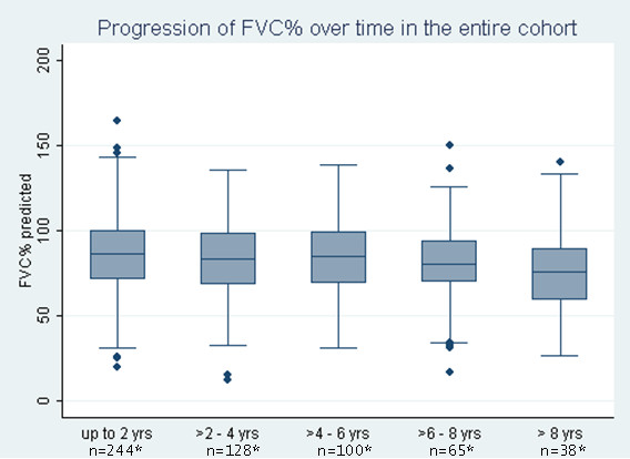
Course of percentage predicted forced vital capacity over 2-year intervals of follow-up. Percentage predicted forced vital capacity (FVC%) data presented in box-and-whisker plots. Each box represents the 25th to 75th percentile: length of box represents interquartile range (IQR); line inside represents median. Whiskers represent 1.5 times the upper and lower IQRs. Circles indicate outliers. *Number of patients who had at least one FVC measurement during the follow-up interval.