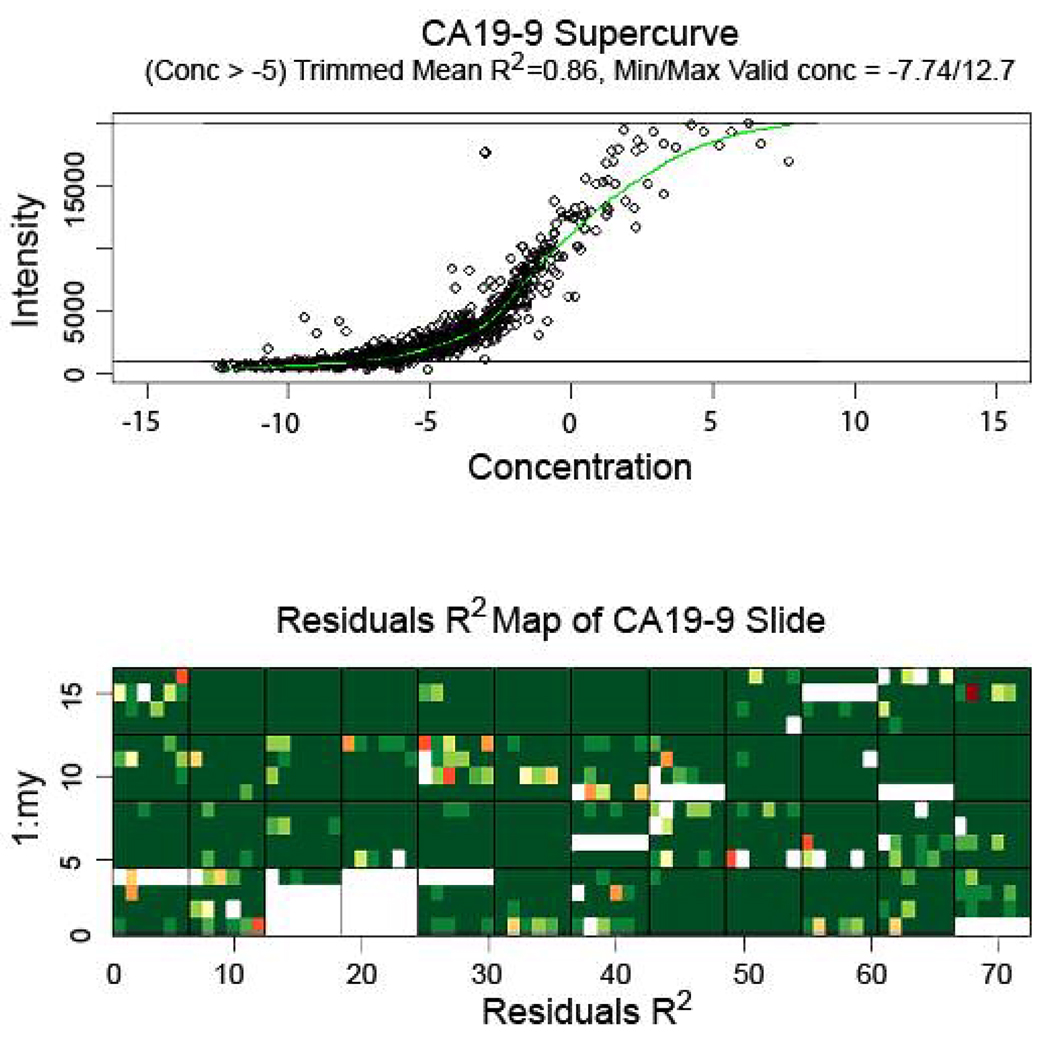
Figure 2.
Supercurve graph (top) and residuals R2 map (bottom) of a representative slide stained for CA19-9. (Top) Supercurve graph shows the antibody response curve produced upon utilizing mean net intensities of all spots on the slide. The slide response curve and each sample concentration are initially estimated and an improved response curve is fit for the slide based on these sample concentrations; hence the x-axis (representing concentration) contains no units. The estimations for slide response curve and sample concentrations are continually iterated until there is convergence. Upper and lower lines represent cutoff levels for upper and lower limits of signal (reflected as minimum/maximum valid concentration); trimmed mean R2 represents goodness of spot fit on supercurve at the point beyond the indicated concentration (−5). (Bottom) Residuals R2 map represents goodness of fit of individual spots on respective positions on the slide to supercurve; green represents best fit; yellow, red, and colorless (blank) progressively worse fit. Large blank areas represent portions of the slide containing negative control samples that were excluded from supercurve analysis.

