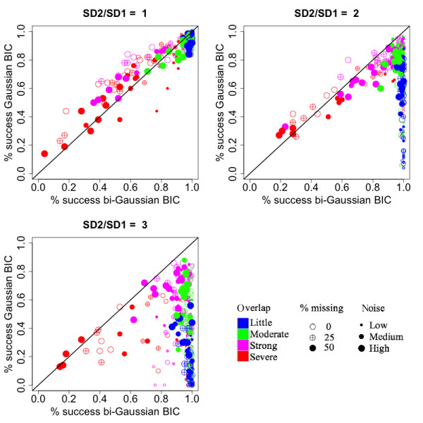
Figure 2.

Comparison of the rate of successfully selecting the correct number of components between the bi-Gaussian mixture model and the Gaussian mixture model. Each sub-plot corresponds to a different degree of asymmetry, as shown in the titles of the sub-plots (ratios between the right- and left- standard deviations). Each dot represents a simulated situation. The values were obtained by averaging the results from 100 simulations. The color represents the level of overlaps between the simulated peaks. The size of the dot represents the amount of noise added to the data. The fill of the dot represents the percentage of values missing in the ion trace.
