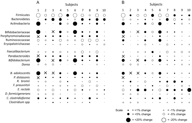
Figure 3. Bubble plots showing differences in the proportions of bacterial taxa (as per cent of the total microbiota composition) detected between the RS4 (A) and RS2 (B) periods when compared to the control period.
The sizes of the bubbles are proportional to the magnitude of the difference. Black circles represent increases in proportions induced through RS treatment, and white circles show a decrease.

