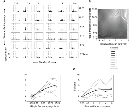
Figure 3.
Selectivity of one neuron for ripple frequency and bandwidth. (A) Response histograms are shown for each ripple frequency and bandwidth combination (bin size = 5 ms). (B) Contour plot showing responses evoked during the 200-ms stimulus at each ripple frequency and bandwidth combination. Lighter regions represent higher spike rates. (C) Factorial plots showing response strength at each level of ripple frequency (—, left), and at each level of bandwidth (—, right). The • indicate the mean rates averaged over bandwidth (left) or ripple frequency (right). The — represent the best fitting (negative) exponential growth functions (y = y0 + a [1 − exp(−x/b)]) to the mean rates.

