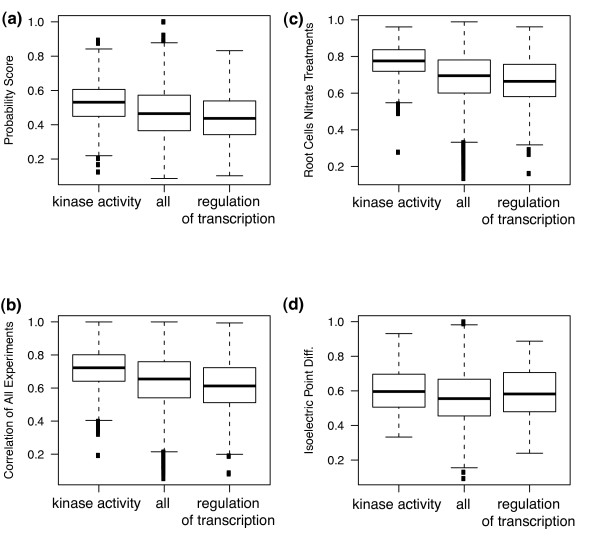
Figure 3.
Trends in redundancy predictions and attributes in different functional categories. Box and whisker plots show landmarks in the distribution of values, where the horizontal line represents the median value, the bottom and top of the box represent the 25th and 75th percentile values, respectively, and the whisker line represents the most extreme value that is within 1.5 interquartile range from the box. Points outside the whisker represent more extreme outliers. The category "all" represents all genes in the large size class (see text) and is used as a background distribution. The two other categories represent genes in the GO functional category named.

