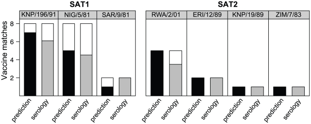
Figure 3. Vaccine matching using sequence data.
Charts show the number of times that the best protective strain estimated using the full serological dataset (header) agrees with the predicted best strain using the sequence data (black bars) or the estimated strains using bootstrap samples of individual serological r1-values (grey bars). White bars are errors, where the predicted/individual r1-values gave a different protective strain.

