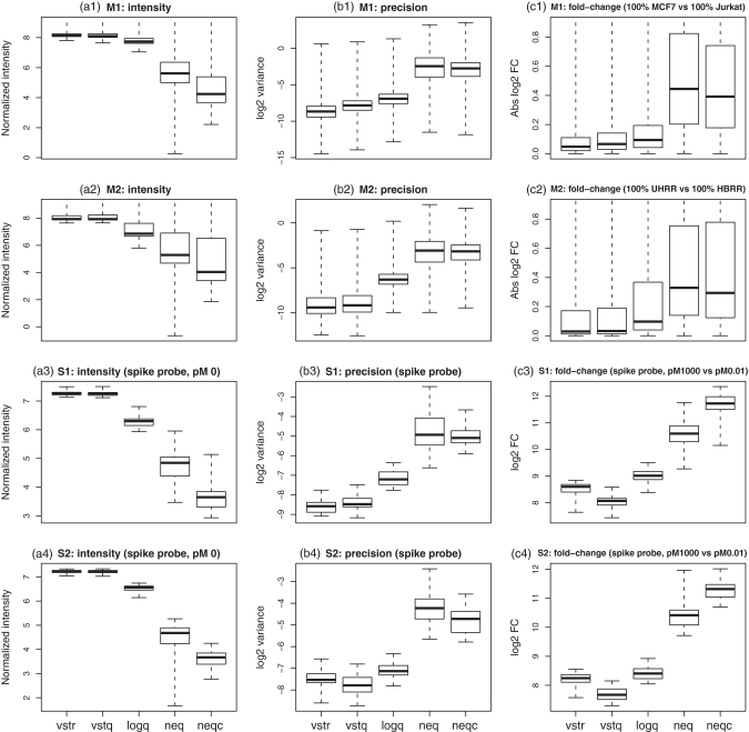
Figure 1.
Operating characteristics of each pre-processing strategy. Shown are boxplots of normalized  intensities (a1–a4),
  sample variances (b1–b4) and absolute
  fold changes (c1–c4) for each pre-processing strategy applied to each data set. Each boxplot shows the spread of values across microarray probes for a particular strategy applied to a particular data set. The vertical axis has been truncated in some cases to better show the main body of the boxplots. The first and second rows show results for mixture data sets M1 and M2, respectively. Panels c1-c2 show fold changes for comparing pure samples. The third and fourth rows show results for spike-in data sets S1 and S2, respectively. Only results for spike-in probes are shown (note that spike-in probes and array probes were normalized together). Panels a3–a4 show intensities for probes for which the spike-in concentration is actually 0. Panels c3–c4 show fold changes from the comparison between spike-in concentrations 1000 pM and 0.01 pM. In the left column (a1–a4), longer boxes indicate a good range of normalized values. In the middle column (b1–b4), lower boxes indicate higher precision. In the third column (c1–c4), longer and higher boxes indicate a greater range of fold changes.

