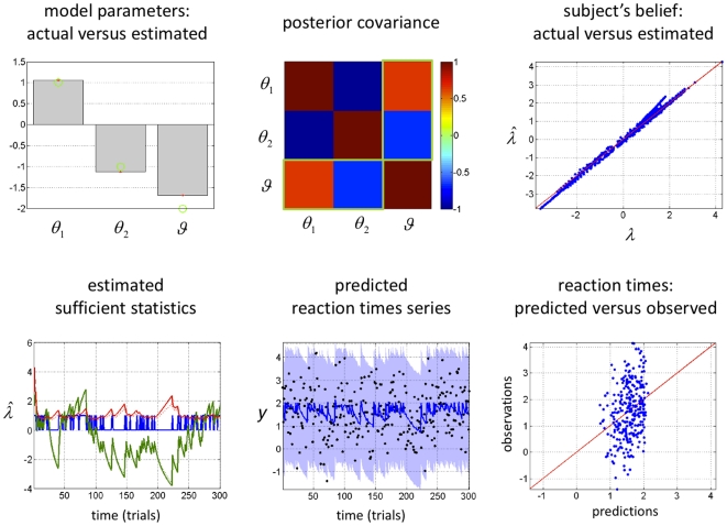
Figure 4. Observing the observer: follow-up example from Figure 3 .
Upper left: Comparison between the estimated (grey bars) and actual (green dots) perceptual and response parameters. Note that simulated and estimated parameters are shown in log-space. Upper centre: posterior joint correlation matrix of the perceptual and response parameters (the green rectangles depict the correlation between the perceptual parameter  and the response parameters
  ). Upper Right: scatter plot comparing the simulated (x-axis) and estimated (y-axis) sufficient statistics
  of the approximate subject's posterior. Lower left: time series of estimated (solid lines) and simulated (dotted lines) sufficient statistics
  of the approximate subject's posterior (blue: cue identity, green: expected association, red: posterior variance of the associative strength). Lower centre: time series of the simulated (black dots) and predicted (solid line: posterior expectation, shaded area: 99% confidence interval) reaction times. Lower right: scatter plot comparing the simulated (y-axis) versus predicted (x-axis) reaction times.

