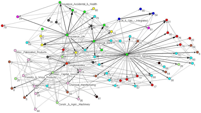
Figure 3. PCPG analysis of the 300 stocks, grouped by their corresponding sub-sector.
In this network we present how each sub-sector is affecting the other sub-sectors. The color of vertices is according to the economic sector each sub-sector belongs to. Specifically, basic materials (violet), capital goods (light green), conglomerates (orange), consumer cyclical (tan), consumer non cyclical (yellow), energy (blue), financial (green), healthcare (gray), services (cyan), technology (red), transportation (brown), and utilities (magenta). Sub-sectors with a positive relative influence  according to Eq.(5) are labeled in the figure. Sub-sectors labeled with numbers are listed in Table S2. We find two main hubs in the network - the investment services and the insurance life sub-sectors. The thickness and gray level of links is proportional to the logarithm of the weight of the link.

