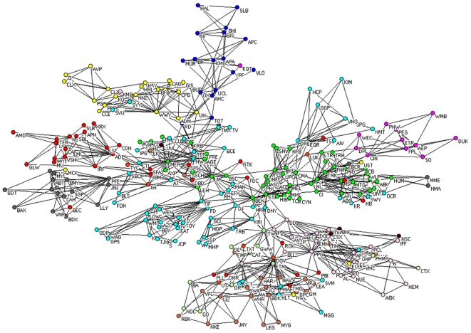
Figure 5. PMFG (standard correlations) of the 300 stocks.
Colors of vertices in the network are chosen according to the economic sector each stock belongs to. Specifically: basic materials (violet), capital goods (light green), conglomerates (orange), consumer cyclical (tan), consumer non cyclical (yellow), energy (blue), financial (green), healthcare (gray), services (cyan), technology (red), transportation (brown), and utilities (magenta).

