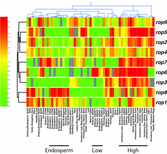
Figure 7.
Hierarchical cluster diagram for all nine maize rops and all 57 MPSS experimental samples. Two dendograms are shown, clustering both the RNA samples (above the diagram) and the genes (to the left of the diagram) based on similarity of expression profiles. Gene names are to the right of the diagram, and short descriptive titles for each experiment are below. MPSS values were normalized (see “Materials and Methods”), and the relative level of expression for each gene is represented using a log-based color scale (left), from red (representing a 5-fold or greater increase over median) to yellow (median level = 1) to green (a 5-fold or greater decrease from the median). Genes are represented by a row of colored boxes; experimental samples are represented as columns. Grays represent MPSS values between 5 and 0, which are not significantly different from zero, at a 95% confidence level; these values were ignored by the clustering algorithms. Six of seven pairs of duplicate samples cluster in close proximity, from left to right: endosperm, 35 d after pollination (DAP); seedling primary root; embryo, 45 DAP; endosperm, 45 DAP; embryo, 35 DAP; and rind. The three sample clusters discussed in the text are noted by bars below the experiment titles.

