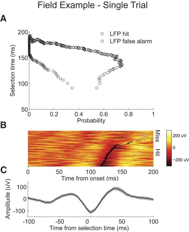
Fig. 6.
Example LFP recording single trial analysis. A: probability of correctly detecting a single trial from condition 1, “LFP hit” plotted against the selection time as the level of the AccLLR detection threshold is varied from a low value to a maximum value (circle). Probability for incorrectly detecting a trial from condition 2, “LFP false alarm” (square). B: waveforms of condition 1 LFP activity color-coded on a linear scale. Waveforms are sorted by selection time. Selection time calculated for each trial is marked (black rectangle). Waveforms of condition 1 LFP activity for missed and incorrectly detected trials are plotted above. C: mean LFP response for correctly detected condition 1 trials aligned to selection time; 95% CIs (shaded).

