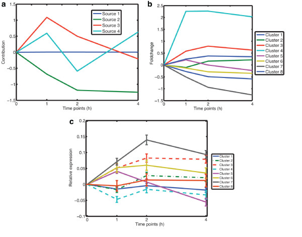
Figure 6.
Result of PCA, k-means clustering and FunCluster. (a) illustrates the result of PCA for the time-course data of IL-6 stimulated hepatocytes. The x-axis corresponds to the measured time-points and the y-axis gives the centered (to time point 0 h) contributions of the mixing matrix. The result of the k-means clustering is shown in (b). The x-axis shows the measured time-points and the y-axis shows the fold-change values of the centroids at that time-points. (c) shows the result of FunCluster. The plot shows the mean expression of the different cluster and the bars indicates the standard deviation at a particular time-point. The x-axis shows the measured time-points and the y-axis shows the relative expression at that time-points.

