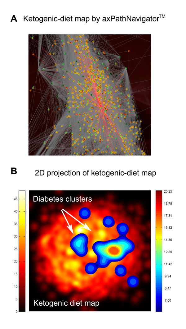
Figure 1.
Ketogenic diet map and type 2 diabetes. A) Ketogenic-diet map by axPathNavigator™. Spheres represent proteins, lines are relationships between proteins and green triangles indicate proteins which are drug target. Seed proteins are colored in dark green. B) Diabetes clusters on 2D projection of ketogenic-diet map obtained through MDS transformation. The underling layer represents the ketogenic-diet map, the color grading of the image gives us an idea of the protein density, from black, no protein, until yellow areas of high protein density, see adjunct scale left (protein/pixel2). The overlaying image shows the location and density of the diabetes cluster on the ketogenic-diet map. Again, the color grading of the image gives us an idea of the protein density in this case from blue (low protein density) to dark red (high protein density), see adjunct scale right (protein/pixel2).

