Figure 3.
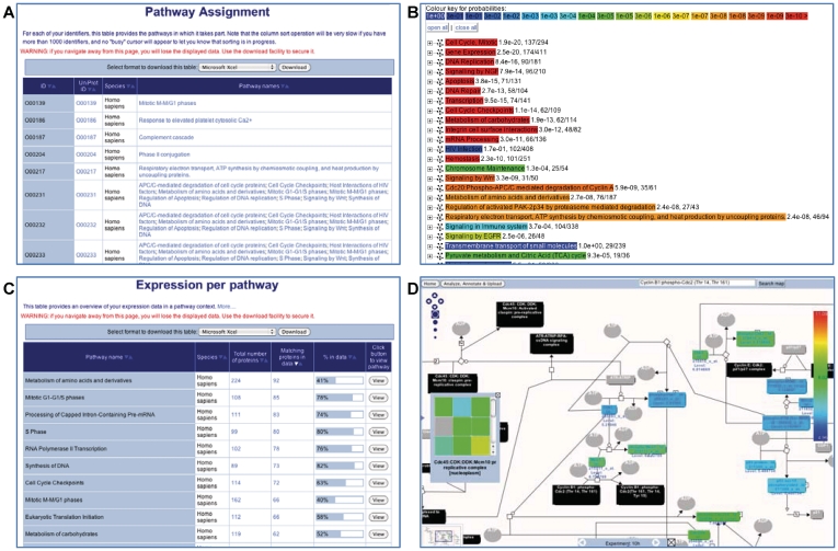
The pathway and expression analysis tools. (A) The results table for the ‘ID mapping and pathway assignment’. The sortable table contains one row for each Reactome pathway and four additional columns: repeats the user-supplied IDs, the corresponding UniProt ID, the species name and names of pathways in which this ID can be found. The names/IDs in the last two columns are clickable links that take the user to a diagram of the named pathway. (B) The results for the ‘overrepresentation analysis’, presented as a list of clickable links of enriched events. The warmer the color, the higher the level of overrepresentation in the given pathway. Clicking on the ‘+’ next to the pathway name gives access to the user-supplied identifiers that are found in the pathway, along with the corresponding UniProt IDs. (C) The results table for the expression analysis. The sortable table contains one row for each Reactome pathway and five additional columns: name of the pathway, Species of presented results, total number of proteins in pathway, number of proteins in the user-supplied data that fall into the pathway, graphical representation of the ratio of these two values and a ‘View’ button that creates a pathway diagram. (D) The pathway browser displaying the colored physical entities that correspond to expression values of the experimental data. The nodes in this diagram have a special color-coding: gray, no match; black, a (multicomponent) complex entity; and other colors represent expression levels. If the numerical data are a time series, the grey bar at the bottom of the colored pathway diagram allows the user to step through time points and visualize changes in expression levels with time of the individual genes involved in the pathway.

