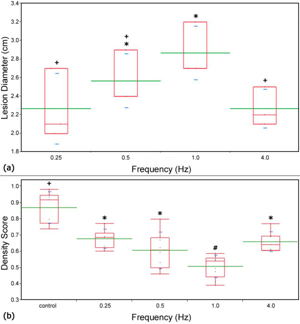
Figure 3.

Lesion diameter and density score vs. pulse frequency. Plots comparing the (a) measured lesion diameters for the plate electrodes and (b) density score for each experimental frequency. Box plots (red) which share a common symbol (+, *, or #) were not statistically different from each other for (a) α = 0.1 and (b) α = 0.05. The average value and standard deviations are represented by green and blue lines respectively. The box plots represent the interquartile range between the 25th and 75th data percentiles. The largest lesions developed and the lowest density score was observed when pulses were applied at a frequency of 1 Hz
