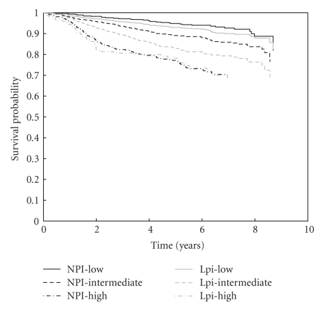
Figure 2.
Kaplan-Meier survival curves for risk groups according to NPI (black lines) and Lpi (grey lines). The solid, dashed, and dot-dashed lines represent the low, intermediate, and high-risk group, respectively. The survival curves for both low-risk groups and for both high risk groups do not differ significantly. However, since the Lpi classifies significantly more patients into the low-risk group, the survival for Lpi intermediate risk patients is significantly lower than for NPI intermediate patients.

