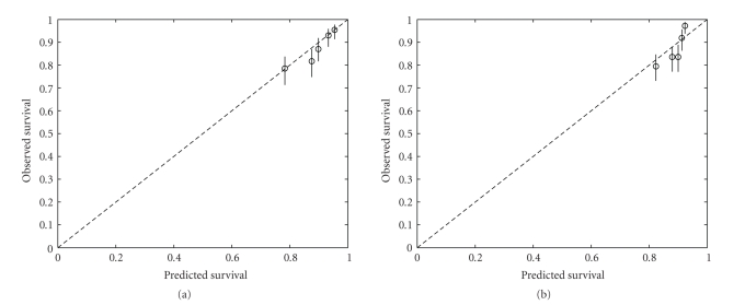
Figure 3.
Calibration plot: (a) NPI, (b) Lpi. The test data are divided into 5 groups according to the value of the NPI (Lpi). For each group, the observed survival as calculated by the Kaplan-Meier estimator at 5 years and the median predicted survival at 5 years are plotted (circles). Ideally, the circles should lie on the dashed line. 95% conference intervals on the observed survival probabilities are represented by the vertical lines. The NPI is better calibrated than the Lpi.

