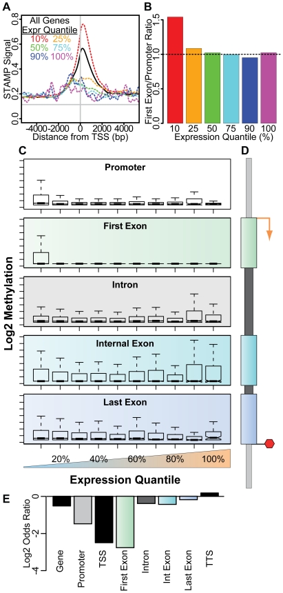
Figure 6. Correlation of transcript expression with the pattern of intragenic methylation in M091 cells.
(A) The composite density plot of methylation surrounding the TSS is shown for all transcripts (solid black line) and for transcripts that are in various expression quantiles (dashed colored lines). Methylation for transcripts in the lowest 10% expression quantile (red) is significantly higher than for genes that are within the next 15% expression (orange). Transcripts with higher expression have even less methylation. (B) The ratio of first exon to promoter methylation is shown for transcripts in the lowest 10% (red), 10–25% (orange), 25–50% (green), 50–75% (cyan), 75–90% (blue) and 90–100% (magenta) expression quantiles. (C) Intragenic STAMP methylation is shown for transcripts in each of 10 expression quantiles (lowest 10% to 100%). Box plots of methylation within the promoter (white), first exon (green), any intron (grey), internal exons (cyan) and the last exon (blue) are shown as indicated. (D) Schematic of the promoter and intragenic elements is shown with the color code utilized in (C) and (E). (E) The odds ratio (log2 transformed), calculated using Fisher's exact test for count data, shows the likelihood of a transcript being expressed (greater than the lowest 10% expression quantile) if it is methylated (top 90% methylation quantiles) within the indicated component of the gene cassette.

