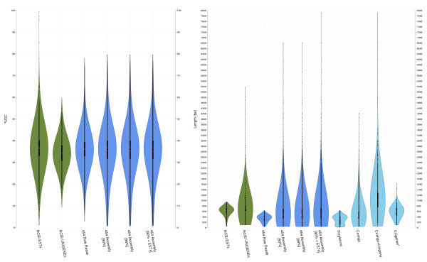
Figure 2.
GC content and length distributions of different assemblies. Violin plots show the distribution of frequencies of a given variable in different datasets using a density kernel estimator [71]. White marks on the violin plots indicate the median value for a given variable, and the red points indicate the mean. The thick line marks the 25/75% inter-quartile range. GC content (left panel) distribution is quite similar in all the datasets, with higher frequencies around 35%. Nucleotide length (right panel) highlights the major differences between un-assembled (NCBI ESTs and the 454 raw reads) and assembled (NCBI UniGene, 90, 98 and 90e) sets. The last four plots (light blue) show the length distribution for the component subsets of the 90e assembly.

