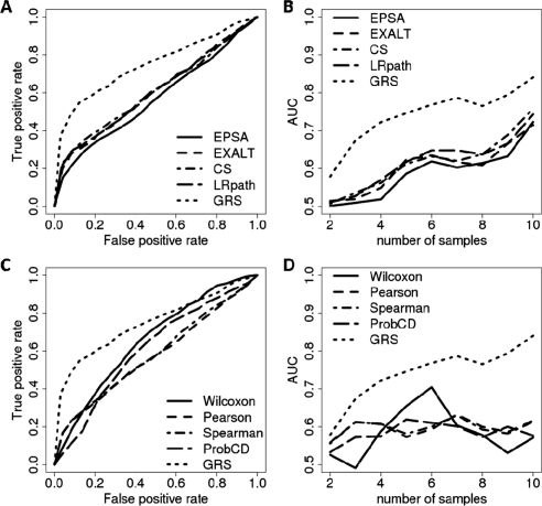
Fig. 4.
ROC curves comparing the performance of different methods for the Connectivity Map data (Lamb et al., 2006). (A, C) Examples of the ROC curves for a fixed samples size (N = 5). (B, D) Areas under the ROC curves for different methods and sample sizes (N = 2, 3,…, 10).

