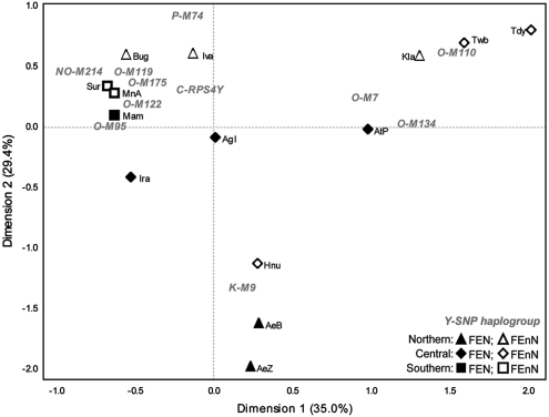
Figure 2.
CA plot based on Y-SNP haplogroup frequencies of Filipino groups. Percentages in parentheses indicate the fraction of the variance explained by each dimension. Haplogroups are in gray text, while population codes are in black text. Population codes are the same as in Figure 1. All groups with sample sizes <10 (Figure 1) were excluded from the analyses.

