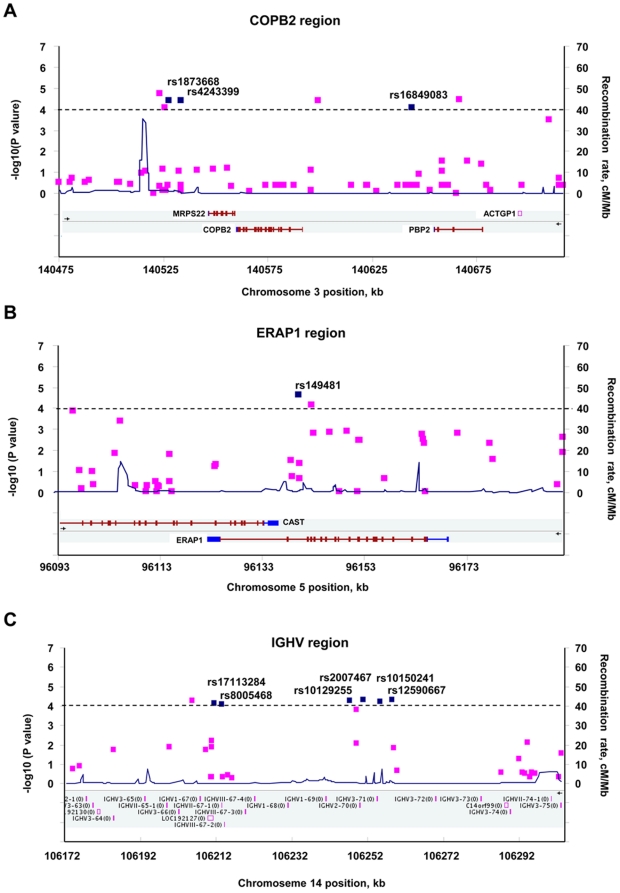
Figure 2. LD structure and association results for disease-association regions.
The −log10 p values (left y-axis) for the best test from the primary scan were plotted as a function of genomic positions based on NCBI Build 36. The SNPs with the strongest signals in the joint analysis are denoted by blue diamonds. Estimated recombination rates (right y-axis) based on the Chinese HapMap population are plotted in blue across the region to reflect the local LD structure around the significant SNPs. Gene annotations were taken from NCBI.

