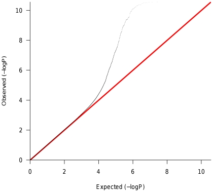
Figure 2. Quantile-quantile plot of p-values.
Each point represents the p-value (log-scale) from a test. Expected values are plotted on the horizontal axis and observed values are plotted on the vertical axis. The expected distribution under the null hypothesis is represented by the diagonal red line. An excess of small p-values is observed compared to the null model represented by the red line.

