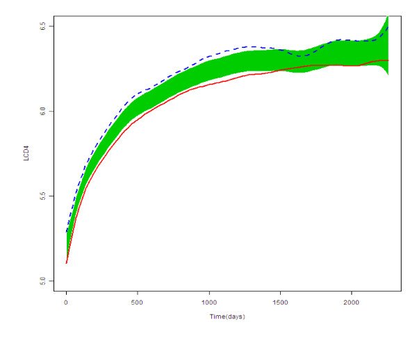
Figure 2.
Population curves for group features and the reference band (shaded area) for the NNRTI group (represented with the continuous red line) and for the NRTI group (represented with the dotted blue line). Legend to figure 2: The figure represents the scatter plot of the logarithm of the CD4+ count (LCD4, y-axis) against time for the two groups under study.

